Weather in NYC

Showing posts with label Chelsea. Show all posts
Showing posts with label Chelsea. Show all posts
Thursday, September 8, 2011
The Gallerina Guide to the Fall Openings in Chelsea
This is a very cool and handy guide that Carolina Miranda at WNYC did for the gallery openings in Chelsea. You can view it on a smart phone or download a PDF. More information can be accessed at her Gallerina blog here. Enjoy!


Friday, June 10, 2011
Gagosian Gallery 555 West 24th street. John Chamberlin, through July 8th

John Chamberlin is one of the major sculptors of the second half of the 20th century, and would be considered an art star by any measure. That star first began to rise early in the 1960's, and unlike a lot of his contemporaries, it didn't fizzle out. Today he's rightfully seen as one of the leading figures of the Post Minimalist movement. Actually his rise happened chronologically around the same time as the Minimalists, but he's considered a Post Minimalist. Now, if you're thinking "Matt, what the hell is a Post Minimalist you pretentious basterd", I'll be happy to tell you. After Minimalism became popular there were a number of artists who rebelled against the principals and conventions of the movement, while embracing some of the freedoms it made possible. These were the Post Minimalists. I suppose the same could be said about the Post Impressionists, or the Post anythings, I guess. Anyway, that's a different discussion.
The Minimalists made hard edge industrial materials, not only acceptable, but preferable for art making, and made inorganic unornamented symmetry the norm. What John Camberlain did was take the industrial, shiny metallic, materials the Minimalists made possible, with all the confrontational honesty that comes with them, and used them to rebel against Minimalism's clean, reductionist aesthetic. He took discarded automobiles, and twisted and crushed them into strange and organic shapes, thus replacing the Minimalist aesthetic with a felt, spontaneous asymmetry, that was even baroque in form. It could be said (and I believe has been) that his messy intuitive aesthetic owes more to Abstract Expressionist painting than to Minimalist sculpture. His forms are more painterly than most paintings I know. I've actually heard some people say that his sculpture looks like Willem deKooning's paintings in three dimensions. I wouldn't say that, but if you want to say it I won't try to stop you. Hey, it's a free country. See if I care.
When Chamberlin is at his best his violently smashed and twisted metal sculptures have a paradoxically playful quality, and an elegance and grace that contradict the materials size and weight. That's a pretty neat trick when he can pull it off, and he pulls it off more often than not. It's also a treat to see the way he merges high concept with technical virtuosity. His use of color is also very thoughtful, and interesting. And, like Abstract Expressionist painting, it looks random, but it isn't. There was a time when it was a real challenge to get past Chamberlin's "junkyard" materials to see the grace and beauty in these sculptures. Clearly that's not really the case any more, but they are still very powerful. I have to say that I think some of the work doesn't quite live up to its aspirations, and just looks large and heavy. Eh, you can't win them all.
This is all new work though, and the fact that the guy is 85 years old, and still turning out this level of sculpture is pretty impressive. I wonder if he has help.
Wednesday, January 12, 2011
Jake Berthot: recent paintings, through Feb 19th @ Betty Cuningham Gallery, c

Betty Cuningham Gallery
Jake Berthot has always had a reputation as a painters painter. He's a veteran who's never been an art star, but if you mention his name to any serious painter the response will undoubtedly be wide eyed admiration. If not, then they're not as serious as they think they are. He made his reputation by creating intuitively felt, moderately sized, non-representational paintings, with very thick, multi layered surfaces. These paintings usually contained some visual anchor such as a lozenge or rectangle form somewhere near the middle of the image, and were painted in a commitedly non objective manner. I always felt like those paintings, because of their clear cut figure ground relationship had one foot (or at least a few toes) in representational image making. Then, sometime in the late 90's Berthot began painting landscapes. In hindsight this makes perfect sense, but it was also a pretty bold move for an established non -representational artist, and at that point, a commercially successful one now entering his late 50's.
There are 13 paintings in this show (not including the two behind the desk), and two drawings. All are landscapes except for one still life. The press release claims that there are two still life's, but the second one must have been hiding when I was there, cause I only saw the one. It's of a scull and a vase arranged on a table. This clearly Cezanne inspired image, while the most specific and clearly recognizable in the show, paradoxically is most reminiscent of his early non-representational work in the fixation on, and handling of the figure ground relationship. The landscapes are less specific. They seem to be more references to trees, and mountains, and of light permeating mist than actual depiction's of them. His colors are, as always beautiful and evocative. Rembrandtesque is the best word I can think of to describe his dark atmospheric pallet as well as his elegant handling of the medium. But, he's referencing a lot of older romantic landscape painters with this work. Rembrandt is just the first that comes to mind. But, the genre is so broad I suppose you could find references from Van Ruisdael, to J.M.W.Turner, to Albert Pinkham Ryder. More interestingly though is how the relationship between form and ground in these paintings moves from indefinite to virtually nonexistent. This is a characteristic organic to the medium of landscape painting, and may be what drew Berthot to it in the first place. It challenged his conventional way of working, and forced him to see things differently; to in some ways reinvent himself.
If you're at all familiar with his early work you will recognize some of the sensibilities and devices he's become known for. In some ways he's a loyal modernist, and is still very conscious of the physical integrity of the painting. All the paintings in the show seem to be physically heavy objects that insist on being recognized literally, even if the subject matter is figurative. One device that's carried over from his early work is the use of thin wooden frames applied to the sides of the canvas before (or possibly during) the painting process. The paint frequently travels from the image onto the frames indicating that they're not afterthoughts. This not only draws attention to the painting as a physical object, but seems to contain the image; locking the viewers, and possibly the artists eyes in. A lot of painters have used some internal framing device, but for different reasons. Giacometti did something similar, but with a painted line and not a literal frame. Another indication of formal abstraction is his use of an underlying grid. This is only clearly visible in one painting and the two drawings, but the suggestion is that it's buried under the pigment of most, if not all of the others. This delicate balancing act Berthot has been playing between modernism and romanticism has served over the years as the primary content of his work. With these recent paintings the artists emotional connection to the landscape, or maybe to the practice and history of landscape painting threaten to drown out his modernist sensibilities. I don't know if that's a good thing or not, but I guess that's just his path to walk.
Wednesday, November 10, 2010
James Cohan Gallery, Roxy Paine: Distillation, Through Dec 11

Roxy Paine is a sculptor with installationist sensibilities. Some would call him (that's right "him") an installation artist with sculptural sensibilities, but they would be wrong, and if they have a problem with that, they can talk to me about it. A lot of people know him from the piece he had on the roof of the Metropolitan Museum about a year ago. I, unfortunately missed that, but this is in the same "Dendroid" series as the Met piece. "Distillation" is one continuous, sprawling, stainless steel sculpture, branching from the front door of the gallery all the way into the back storage room. It starts by the front desk with a large tank that looks like a water heater, which then connects to a big glass beaker in the next room, filled with some powdery yellow substance. From there it grows into a wild twisting metal form that in some places literally runs right through the walls and floor of the gallery. In some ways it looks like a giant water pressure or ventilation system, with all the valves and tanks, and meters placed at various points. In another way it looks kind of like an enlarged metal cast of some creatures circulatory system, with what appear to be hearts placed in various thick tangled sections. It also looks like a tree lying on its side with gnarled serpentine branches and twigs reaching across the room. In one case a group of mushroom heads sprout from an extension. But, in other areas it's hard to tell if we're looking at branches or veins, or synapses. Is this monstrosity animal, vegetable, or mechanical?
In an adjacent room a wall is covered with very delicate mushrooms, and other strange wormy fungal forms, laid out in kind of a loose spiral shape. They appear to be actually growing out of the wall. It's paradoxically repellant and quite beautiful in a tactile sort of way. I'm assuming this is a separate piece, and it would be pretty interesting on its own. It's soft porous material compliments the hard steel surface of "Distilation", but it pales in comparison to the giant piece that takes up about 80% of the gallery.
The first association I made from this huge steel structure was to John Chamberlain, I guess I was responding to the twisted metal and the organic/mechanical highbred aesthetic. But, the more I thought about it I realized that , at least aesthetically the art historical president for this kind of twisting mass of a work that reaches from one room to the next dates back to the high Renaissance and the Sistine Chapel. I know that sounds like a stretch, but indulge me on this. The roots, and soul of this kind of work can be found directly starting with the era of Michelangelo, leading up through the Baroque, and culminating in late Rococo sculpture and tapestries much more so than with anything post minimalist. It's just the materials that point to late, and post modernism. Frank Stella has shown similar sensibilities in his recent work, but that's a different story. The reason I'm focusing on this aesthetic is that it's a direct reflection of the content of the work (as any good art is). What looks at first like organic machinery transforms into a kind of industrial alchemy. Paine is identifying with the long tradition of the artists role as sorcerer or magician. The title of the piece is "Distillation", and you start to wonder what it is that's being distilled, and where can I get some.
Wednesday, June 16, 2010
Claude Monet: late work, through June 26t @ Larry Gagosian

Hat's off to Larry Gagosian for this one. This is a show of 27 paintings from museums and private collections all over the world, that must have cost a fortune to insure, being shown in a commercial art gallery where not a single painting is for sale. That's a rarity. It's also a great show. I know that sounds like it should go without saying since it's Monet, but since he lived to such a ripe old age, and was so prolific, not to mention commercially successful, he did tend to occasionally crank out some half hearted, conveyor belt work. None of that can be seen in this show.
Monet is one of those painters that everyone likes, or at least anyone with a heartbeat should. Today his work is very accessible. Every 16 year old suburban white girl has a poster of one of his paintings in her room, probably next to her collection of beanie babies. This makes it kind of hard to imagine that throughout most of his lifetime his work was seen as radical and difficult to appreciate, but it was. This show concentrates on his late work. After he became wealthy and established he bought his home in Giverny, and painted the large luxurious garden he had built around him. If this sounds decadent or bourgeois, it was. Get over it.
The show covers the years 1904-1924, and is divided up into four galleries. The first three consist entirely of images of water lilies. These make up only a fraction of the water lily paintings he created over these years, a subject that obsessed him so much you'd think he was Kermit the frog. The thing that struck me when I walked into the first of the four galleries was that this work seems to have foreseen, and in some ways laid the groundwork for non-representational art. The way he translated light into paint using a few simple color choices, and in such a physical and tactile way suggests that he was recognizing the surface of the image, and the painting as a literal object. The contrast between the thick impasto of the pigment, and the bare primed canvas is undeniably viscerally beautiful. You can see the influence of these paintings in the work of Joan Mitchell, Hans Hofman, and the early paintings of Philip Guston. Some people have suggested that this was because he was loosing his eyesight, and he needed some tactile clues to construct his images. Who knows? Another thing that suggests a move toward abstraction is the unusual compositions of these late paintings. They lack a clear focal point, or a visual anchoring structure that's used in almost all figurative pictures. Because of this, and the way they're oddly cropped some of them look almost like details of larger images. Also, it's not always clear where the viewer is in relationship to the picture plane, or the imagery inside it. One could see these as early prototypes of the non-hierachtical, all over paintings of Jackson Pollock, or William deKooning.
Something else occurred to me as I entered the third gallery of the show. These are some pretty complicated images. We're not just looking at the water lilies floating on the surface of the water. We're seeing the sky and trees, and clouds reflected off of it. We're also seeing the light passing through the water. And, in some cases we're seeing flowers growing out of the lilie pads, and branches and vines hanging in front of the water. So we're seeing the surface of the water, the sky above it, the water below it, and the things on and in front of it. The whole image is about how light conveys information. It's the furthest thing in the world from being non representational. In fact it's ultra representational. It's much more about representing what he saw than most typical representational painting at the time was. Maybe the reason his compositions were so unconventional was that he was losing interest in making pictures, and becoming more interested in studying nature and the effects of light in it. Maybe he wasn't defying the conventional relationship between the viewer and the picture plane, but simply ignoring it. Or, that the unpainted areas on his canvases were there because he didn't feel the need to complete the picture. Maybe after decades of painting from nature, he'd become more interested in studying it than in making art. His interest in natural light was possibly greater than his interest in picture making. I know these are two totally contradictory interpretations of his work, but I think both are equally valid.
The last gallery (1918-24) is the only one that departs from the water lily subject matter. Here we see paths, and bridges from his garden that are painted in a flurry of spontaneous brushstrokes. The colors are almost violent in their richness and intensity. One painting of a Japanese bridge is so impassionately rendered that it makes Van Gogh look like Thomas Gainsborough in comparison. But, I think the thing that makes these late paintings so important in retrospect is the unusual place Monet positions himself as an early modernist pioneer. Usually toward the end of an artists career (particularly such an established, and commercially successful one) the work can get complacent. The fact that this work is both so very figurative and so very literal at the same time shows the brilliance, curiosity and balls-out ambition of Monet to have the audacity to end his career with a question mark.
Monday, April 12, 2010
My Monday List for April 12th

• For the film heads, Hamilton tonight, April 12th @ BAM. It was shot in Baltimore for $50,000 with non actors. From what I read in the Village Voice, it is an original work done in the slow paced style of "Wendy and Lucy." I saw Wendy and Lucy and it was depressing but I like the style. The realism and grit. In Hamilton I like the promise of originality, of something new. I hope it will be positive. I like the promise of creativity. That is what BAM promises. That is what I get from the synopsis. See it! Some one, anyone, and tell me what I missed. Was it any good? Tag, you're it!
• Broadway. A sure thing is A Behanding in Spokane. I saw this. It was very good. It was very funny. It has a unique story line that is both very dark and disturbingly funny. It is very much character driven. Think about it, this is your chance to see Christopher Walken live with Sam Rockwell, Anthoney Mackie, and Zoe Kazan in a Martin McDonagh play. Each character is unique and comes alive brilliantly. The playwright is Irish, this is the first play that he has set in America, and yet as a New Yorker, I feel he has captured our tenor. Even if it is not nice, at least it is absurd. Enjoy!
For music and more events see Music Hub. I also suggest the Village Voice Events Calendar.
There is always a lot to see even if you don't have much money. For me what always made New York great is its humanity. It is a human zoo and we are its animals! Take it all in. Go to the Meat Packing District, play with the iPad at the Apple store, buy your food at the Chelsea Market, then take a chair, sit back, and take in the spectacle walking by you. It is sure to be all lovely, be it great or small. Use your imagination. I'll be back soon. In the mean time, stay out of trouble but don't stop having fun and if I see you, then let me know what's new.
Thursday, February 25, 2010
Kukuli Velarde at Barry Friedman, March 4 to April 17

Kukuli Velarde - Patrimonio
At Barry Friedman LTD
515 West 26th Street,
Reception for Artist on March 4th at 6PM
On March 4th Kukuli Velarde, who is a very good friend of mine, will have a major exhibition of work covering sculpture, painting, drawing installation and video. She is an artist from Peru who has lived in the United States for 20 years. She is both a master of her mediums and a socially charged artist with a distinct voice. I can't help but strongly recommend that everyone go see the show. I will be at the opening. Maybe I will see you there. Cheers! Here is some more background her here.
Thursday, December 10, 2009
Walton Ford: new work, Nov12-Dec 23
 Paul Kasmin Gallery, 293 10th ave
I think Walton Ford is a pretty interesting artist. This is the second show of his I've seen at the Kasmin Gallery, and the work may not be for everyone, but it's definitely memorable. Ford makes large highly detailed watercolor and ink paintings on paper. There are only 6 works in the show, but because of their size and their nuanced intricacy any more would be overkill. I hesitate a little in calling them paintings, because they clearly reference natural history and wildlife illustrations, like those of John James Audubon. He even uses the same kind of captions describing the animals and events in the margins around the images used in those wildlife illustrations, complete with (I assume) fictional dates. Ford's art is, however much more violent and nightmarish in subject matter than the work he's referencing. He appears to be trying to expand this tradition of painting to include human fears and fantasies of the natural world.
What is most immediately engaging about the work is the contrast between Ford's meticulous, virtuosic rendering, and the horrific and absurdist nature of the things being rendered. As a painter I can't help but be drawn to how Ford has mastered a certain genre of cool scientific illustration, and distorted it in such a way that he can apply it to this fantastically disturbing world where animals are tearing each other and in some cases humans apart. In "The Island" a huge pile of wolf like thylacines sink into the ocean, while devouring dozens of sheep. In another image two bengal tigers attack a lion in what turns into a bloody massacre. In some cases the animals appear prepared to commit suicide. A guerilla stands at the foot of a dead hunter holding his twisted rifle at its own head. Is it trying to blow its brains out, or just playing with a new toy? A baboon looks prepared to hang itself next to a rather stylish outdoor breakfast table. Or, is it auto erotic asphyxiation? As best I can tell, the content of Ford's work is the relationship between human culture and animal nature. Or maybe it's the other way around.
Sunday, June 28, 2009
The High Line is Now Open
We are now free to walk the High Line, at least the first third. It is beautiful piece of architecture that has been saved and transformed into a walk way across the city. Here are some pictures that I took. It is well worth a visit.
Sunday, June 14, 2009
Matthew Marks Gallery, 523 West 24stCharles Ray May 8- June 27
 The Matthew Marks Gallery
To call Charles Ray an interesting artist would be a huge understatement. He's one of the most influential artists of his generation. That generation being of the late 80s and early 90s, which is why the three pieces chosen for this show were first exhibited over twenty years ago. "Ink Line", "Spinning Spot", and "Moving Wire" are all kinetic sculptures, or conceptual minimalist installations (whatever), and were all created in 1987 and 1988.
"Ink Line" is a continuous stream of black printers ink pouring out of a small opening in the ceiling of the gallery, and into an equally small opening in the floor. At first glance it looks like a static string or cable, and only on closer inspection can you tell that it's a moving liquid. "Moving Wire" appears to be two wires protruding from the galleries wall ten inches apart. Soon the viewer realizes that one wire is slowly moving out of the wall while the other one equally slowly retracts, indicating that the two wires are connected somewhere behind the wall. "Spinning Spot" is a cement disk inserted into the galleries cement floor that spins at 33RPMs. Personally I think It's the least intriguing of the three.
Rays work initially elicits a "cool, look at this" or "isn't that clever" gut level response, which I think undercuts the seriousness of the work. One thing he does that is pretty interesting is that he employs a hidden force outside the galleries interior for all of the works in the show, making the viewer more conscious of their environment, and how it limits what they see and know. Using that force he plays with perception in the tromp l'oeil tradition, but updating that tradition so that instead of dealing with two and three dimensional space he's dealing with static and kinetic energy. He also uses potential energy to take a unique turn on the artistic tradition of exploiting the seductive, tactile quality of the materials. You have a strong desire to touch the work, but (especially with "Ink Line") you know the potential damage you could cause. In fact it's the potential damage that amplifies the works tactile seductiveness. He's also one of the few conceptual artists I can think of that seems to make aesthetics a priority. Formally all three works function as very graceful, three dimensional line drawings, where elegance compliment conceptual imaginativeness. Now I'm Just wondering what he's doing today.
Monday, May 25, 2009
Mitchell-Innes & Nash, 534 West 26 street Jessica Stockholder May 7-June 20
 Mitchell-Innes & Nash
Jessica Stockholder is a highly respected artist who's been showing for a long time, and I've seen a lot of her work over the years. I have to admit that I don't fully understand what she's doing or know if I even like it, but there's something about her that I think is interesting. Maybe it's that she's hard to really define. I usually hear her referred to as a sculptor, although I imagine sculpture purists would dispute that. She's also called an installation artist, although the spontaneous, haphazard appearance of her work really challenges the tradition of that medium. In fact her choice of materials and the way she combines them seems kind of silly, and even arbitrary. They don't appear to have any relationship to one another either formally or thematically. That kind of sloppy intuitiveness is a quality you see more often in painting than in sculpture or installation art. In fact some of the work does have big strokes of paint on it, though you'd really be pushing it to call her a painter. But, her work isn't just challenging to tradition, or catagoration. The objects and the way they're put together are about as disharmonious as any art I've seen. While I can't figure out what she's aiming for, I have to admit that her total disregard for aesthetics is pretty impressive.
Friday, May 1, 2009
Movies listings in Chelsea
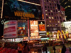
I get asked a lot about what movies are showing in Chelsea so I figured why not just bookmark the search and post it to my blog for all to see. So go find what you want here and thank me later. Cheers!
Bargain Classics in Chelsea with attitude

For those who want the return of the classics on the big screen mixed with some Chelsea romp , I suggest you check this out at the Chelsea Classics Clearview. I remember when the big thing on Friday was the Rocky Horror Picture show at midnight, now there is the classics on Thursday at 7PM for $7.50. That is more my speed. Would you go?
Subscribe to:
Posts (Atom)